
Unity3D: Styling a GUI toggle
Posted by Dimitri | Aug 26th, 2013 | Filed under Programming

This post shows how to use a custom GUISkin to style a GUI toggle. So, this tutorial is going to be a little different from the other ones featured on the website, since it will focus more on how to use the Unity3D engine itself rather than the code.
A sample project is available at the end of the post, which is the reference to all of the examples given in this tutorial.
So, in order to style a toggle, or any other Unity3D GUI element for that matter, a GUISkin file is required. This file holds all information regarding rendering a group a GUI elements (GUIStyles), such as the image to use as a background, the font to use, the color, size, alignment, just to name a few. Also, a script is necessary to read the GUISkin and apply the correct GUIStyle to a GUI element, in our case, a toggle.
So, to create a GUISkin file, right-click an empty space at the Project tab. Then select Create → GUI Skin:
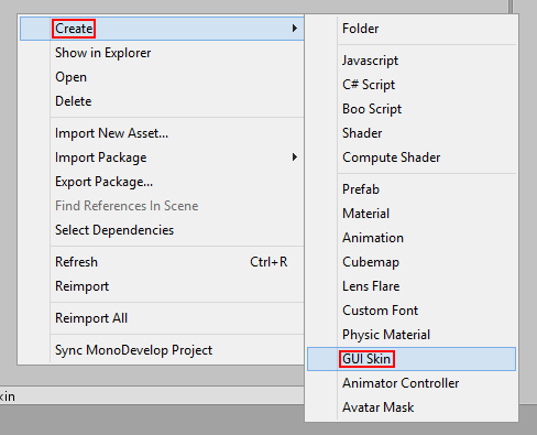
Right-click an empty space at the Project tab. Then select Create → GUI Skin.
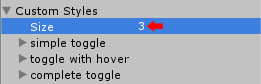
Rename it any way you see fit, it doesn’t matter. Now, open the GUISkin, and at the Inspector and expand the Custom Styles tree. Set the size to 3:
Normally, only a single GUIStyle is needed to customize a toggle. This post is using three different GUIStyles because it will show three distinct ways to do it.
Since this post is going to show three different ways of customizing the looks a toggle, three different Custom Styles entries are needed. I’ve named them simple toggle, toggle with hover and complete toggle as can be seen on the above image. They will be referenced as such for the rest of this tutorial.
As the name suggests, the first one is just a simple toggle with two custom background images, one for the true state, and the other one for the false state. The second one is the same as the previous one, but with the hover state, therefore, four different images are required. The last one is a toggle that compromises of six different images, three for each of the toggle states (three images for when the toggle is set to true, and another three for when it’s set to false).
On the following sections, you will find a detailed explanation on which image goes with each GUIStyleState. Use the following list to jump directly to a section:
- Simple Toggle (two images)
- Toggle with hover (four images)
- Complete toggle (six images)
- A simple toggle script
- Aligning the text label that goes with the toggle
- Additional Notes
- Example and source project download
1. Simple Toggle (two images)
First, create two images that will represent the toggle when it’s set to true and the other one when the toggle is set to false.
Then, just drag and drop the image file that represents the toggle when it’s set to false, on the Normal‘s Background slot. For the true state, drag and drop the image that represents that state on the On Normal‘s Background slot:
Just drag and drop the images at the Normal and at the On Normal background image slots.
Now, when this GUISkin is assigned to a toggle on a script, it will render a toggle with a black toggle box and a red indicator. (More on the code later, at the Script section)
Just a small observation regarding the GUIStyleStates naming scheme: the Normal, Hover, Active states, in Unity, will be used when the toggle set to false. The On Normal, On Hover, On Active are the GUIStyleStates that will be rendered when the toggle is set to true. The “On” present in the names of those GUIStyleStates should not be interpreted as “upon” or “when”, e.g.: On Active: when the toggle gets activated (wrong!). But rather, as “when the toggle at the true state is activated”.
That said, only two GUIStyleStates were assigned a background image. The first one, the Normal state, is rendered when the toggle is set to false and the second, the On Normal state, which gets rendered when the toggle is set to true.
That’s good enough for most of the cases, but what if you need to show the user exactly which toggle is he/she is about to select?
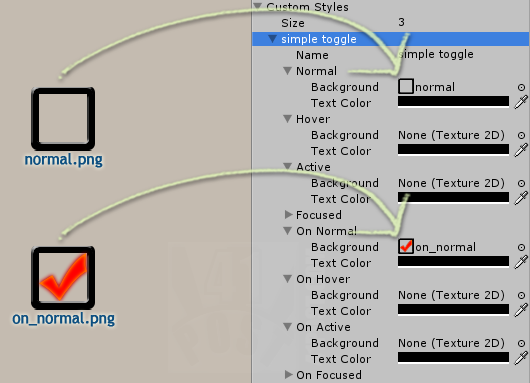
2. Toggle with hover (four images)
This time, create four images: one that will represent the toggle when it’s set to true, another for when the toggle is set to false. Then, create an image that represents the toggle when the cursor is hovering over the toggle and it is at the false state. The last image is going to be the toggle when the cursor is hovering over the toggle and it is at the true state.
Again, just drag and drop the image file that represents the toggle when it’s set to false to the Normal‘s Background slot. For the true state, drag and drop the image that represents it on the On Normal‘s Background slot. For the false hover image, just drag and drop it at the Hover GUIStyleState background slot. The same must be done for the true hover image, however it must be assigned to the On Hover GUIStyleState:
Drag and drop the images at the Normal, Hover, On Normal and On Hover background image slots.
3. Complete toggle (six images)
This requires the same four images mentioned above: one that will represent the toggle when it’s set to true, another for when the toggle is set to false. An image for when the cursor is hovering over the toggle and it is false and an image for when the cursor is hovering over the toggle and it is true.
On top of that, this will require two additional images that will only be rendered when the toggle is clicked/selected and the mouse button is down or, on mobile devices, when the user pressed the screen but still hasn’t released it yet. Again, two images are required, because one is for the true and the other for the false state.
One more time, just drag and drop the image file that represents the toggle when it’s set to false to the Normal‘s Background slot. For the true state, drag and drop the image that represents that state on the On Normal‘s Background slot.
For the false hover image, just drag and drop it at the Hover GUIStyleState background slot. The same must be done for the true hover image, but it should be assigned to the On Hover GUIStyleState slot.
And, for the false active image, assign it to the Active GUIStyleState background slot. The On Active GUIStyleState should reference the image that represents the toggle being selected while it’s true, like this:
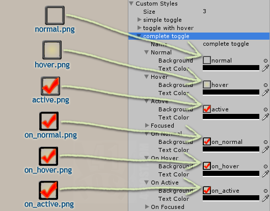
Drag and drop the images at the Normal, Hover, Active, On Normal, On Hover and On Active background image slots.
4. A simple toggle script
Here’s the code that will render the three toggles:
using UnityEngine;
using System.Collections;

public class SkinnedToggleGUI : MonoBehaviour
{
	public GUISkin testGUIskin;

	private bool firstToggle = false;
	private bool secondToggle = false;
	private bool thirdToggle = false;

	void Start ()
	{
		if(this.testGUIskin == null)
		{
			Debug.LogError("Please assign a GUIskin on the editor!");
			this.enabled = false;
			return;
		}
	}

	void OnGUI ()
	{
		this.firstToggle = GUI.Toggle(new Rect(32,16,64,64), this.firstToggle, "Simple Toggle", this.testGUIskin.customStyles[0]);
		this.secondToggle = GUI.Toggle(new Rect(32,96,64,64), this.secondToggle, "Toggle With Hover", this.testGUIskin.customStyles[1]);
		this.thirdToggle = GUI.Toggle(new Rect(32,176,64,64), this.thirdToggle, "Complete Toggle", this.testGUIskin.customStyles[2]);
	}
}
This code is actually pretty simple. First a GUISkin object is declared as public (line 6). Then, three booleans are declared and initialized to false, one for each toggle (lines 8 to 10).
The Start() method just checks if we didn’t forget to assign a GUISkin file to the script at the Inspector. The script won’t continue if that’s the case (lines 12 to 20).
Finally, the OnGUI() method will render the toggles. The code is exactly the same for each toggle, so only the first line on this method will be explained.
The toggle is rendered by calling the static GUI.Toggle() method. This version of this method takes four parameters. The first parameter is the Rect that defines the position on the screen (x and y coordinates), and size (width and height) of the toggle box. The second parameter is a boolean, that specifies if the toggle must be rendered at the true or false state. The third parameter is a string, that will be rendered as a text label with the toggle box. The fourth and last parameter specifies which GUIStyle to apply to the toggle. The GUI.Toggle() returns a boolean value, showing whether it has been set to true or false. This is saved at the same boolean passed as the second argument (line 24).
The same is done for the toggles at lines 25 and 26.
Don’t forget to drag and drop the GUISkin file to the script’s ‘Test GUISkin‘ slot at the Inspector:
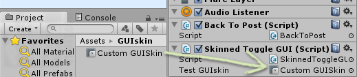
Don’t forget to assign the GUISkin file to the script.
5. Aligning the text label that goes with the toggle
It’s almost certain that when you set custom images to a toggle, it will be too big and the accompanying label next to it will be overlapping the image.
As previously explained, the Rect on the script specifies only the size of the toggle box. This means that it doesn’t take the text label into account. In order to align the text label correctly, some GUIStyle properties must be adjusted. The changes to those settings depends on the size that the toggle box is rendered.
Let’s take the sample project as an example. There, all of the toggle boxes were rendered at a size of 64×64 px. In that case, to align the text, set the Alignment property to Middle Left and set the Content Offset → X to a value that is equal or greater than the width of the toggle box. That way, the text will be placed to the right of the toggle. On the sample project, I’ve set it to 70, and since the toggle is being rendered with a width of 64 px, the text is aligned 6 pixels (70 – 64 = 6) to the right of the toggle box.
To sum it up, this is a screenshot of one of the toggle’s GUISkin properties:
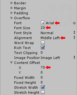
Changes to the default values are indicated by a red arrow. These settings are the same to all of the three custom styles that are customizing the toggles.
Notice that the Font and Font Size parameters have been changed. This was done to make the text label bigger, to match the size of the toggle box. This isn’t necessary in order to align the text label.
It’s also possible to align the text label using the Padding property. Not only that, but if the GUILayout class is being used to render the toggle instead of a GUI class, the toggle box size can be set using the Fixed Width and Fixed Height properties. Or, you could get the width that the toggle box is going to be rendered, at the code. Then, only after knowing the width of the toggle box, offset the text label accordingly.
6. Additional Notes
Some readers may have noticed the Focused and the On Focused states. These ones aren’t used by the toggle.
If a background image for the state isn’t present, it automatically falls back to the previous GUIStyleState on the same toggle state. In other words it means the following:
- Toggle is set to true:
- No background image assigned to On Active, Unity will try to use the one assigned to On Hover
- No background image assigned to On Hover, Unity will try to use the one assigned to On Normal
- No background image assigned to On Normal, Unity will try to use the one assigned to Normal
To put it simply, the fallback order, for the toggle at the true state is: On Active → On Hover → On Normal → Normal.
- Toggle is set to false:
- No background image assigned to Active, Unity will try to use the one assigned to Hover
- No background image assigned to Hover, Unity will try to use the one assigned to Normal
The fallback order, for the toggle at the false state is: Active → Hover → Normal.
Also, if your game will only have a single toggle throughout all the GUIs, please use the toggle GUIStyle, instead of using a CustomStyle. It’s more readable and it will be much easier to reference it on the code.
Lastly, here’s a particularity when customizing toggles on Unity up until version 4.1: the text label color only changes if there’s an image associated with the GUIStyleState‘s background. This means that, if you want to change the text label color when hovering over the toggle and not the image, you will have to assign the same images defined for the Normal and On Normal states to Hover and On Hover, respectively.
7. Example and source project download
Here’s a screenshot of the source project:
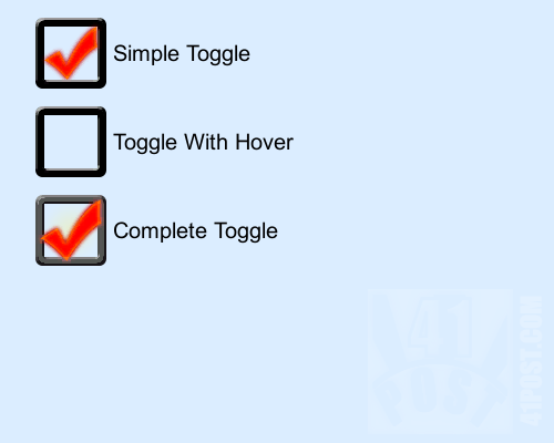
Example Project Screenshot
To open the source project at the web player, please visit this link (opens in a new window).
Get the source project here:
Downloads
That’s it! Please, don’t forget to leave your comments below.
Want to see more posts like this more often? Please donate by clicking at the button below:
Don't feel like donating? Alternatively, you can support the site by purchasing the FULL version of the Arrows Live Wallpaper app at the Google Play Store™:

Thanks a lot!
Nice ,learned some new things ! Keep up with GUI tuts!
Really helpful! Thanks very much for the post.
Is OK that I use the icons in my app for my kids?
Super post, ogólnie się z Tobą zgadzam, jednak w niektórych kwestiach bym polemizowała.
Z pewnością sam blog zasługuje na szacunek. Jestem pewna, że tu
jeszcze wpadnę.